Spotify Website
case study
Using the same content (or maybe some new), redesign and explain how your execution is a better experience for the user, increases memberships, and highlights the Spotify brand experience.
How would you revitalize the visuals of this page to feel exciting and elevated, yet simple and easy to digest?
How would you better display the featured plans to make it easy on users to select what is best for them?
Objective of this case study
Introduction
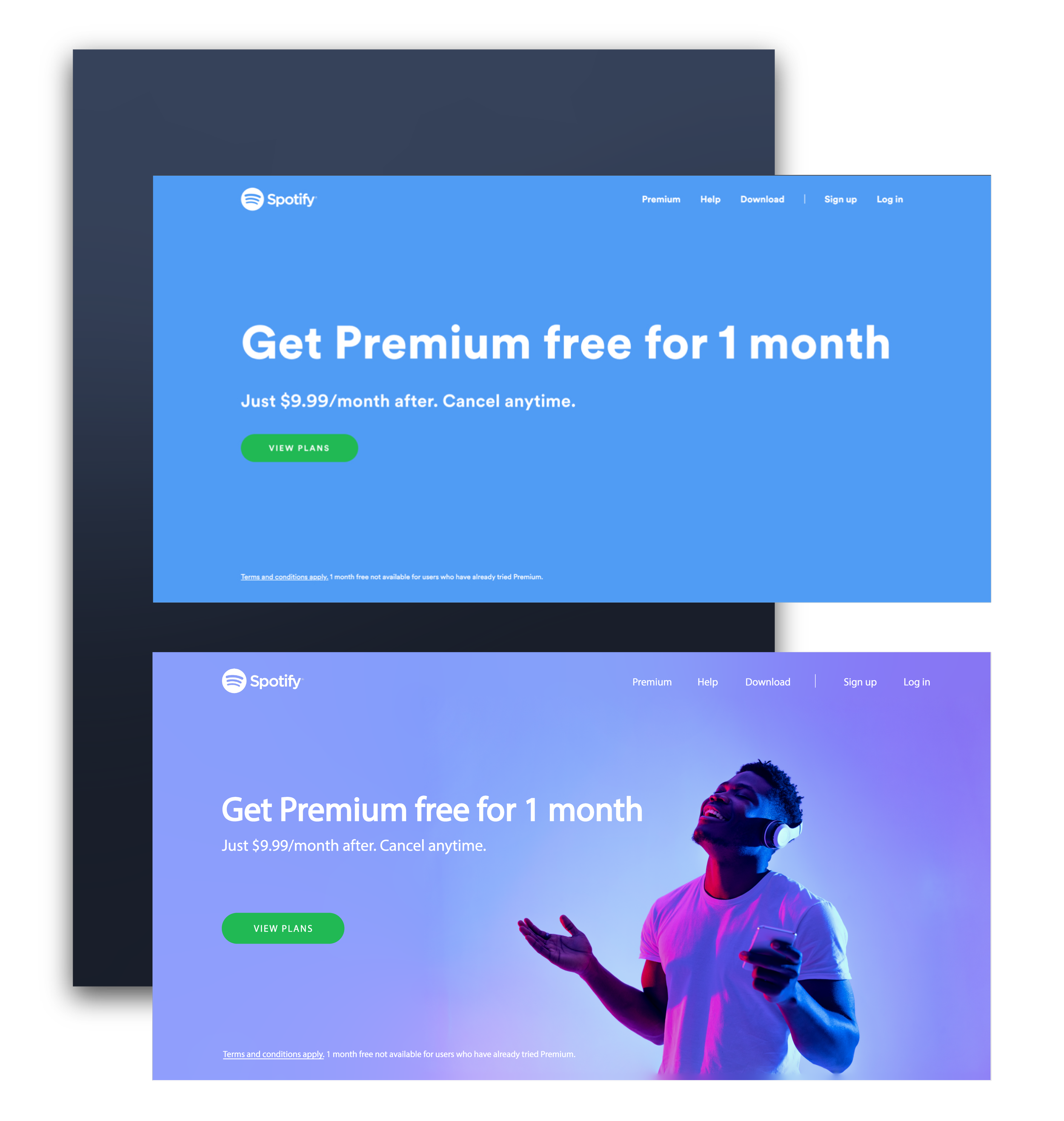
Capturing a user's attention immediately upon opening a webpage is crucial, and it's equally important to communicate Spotify's value clearly and effectively from the start. To align with Spotify's brand, which emphasizes connection, emotion, and a vibrant music experience, I incorporated an image of a person enjoying music. This visual conveys the emotional and immersive experience Spotify offers, creating an immediate and relatable connection with users by showcasing the joy of engaging with the platform.
To further reflect Spotify's dynamic brand identity, I introduced vibrant splashes of color to represent the range of emotions users might feel while listening to music on Spotify. These dynamic visuals bring energy and vitality to the design, symbolizing how Spotify transforms the listening experience into something alive and expressive. This redesign not only enhances the webpage’s aesthetic and user engagement but also reinforces Spotify's position as a brand that brings music, and emotions, to life in a way that resonates deeply with its audience.
Premium Features
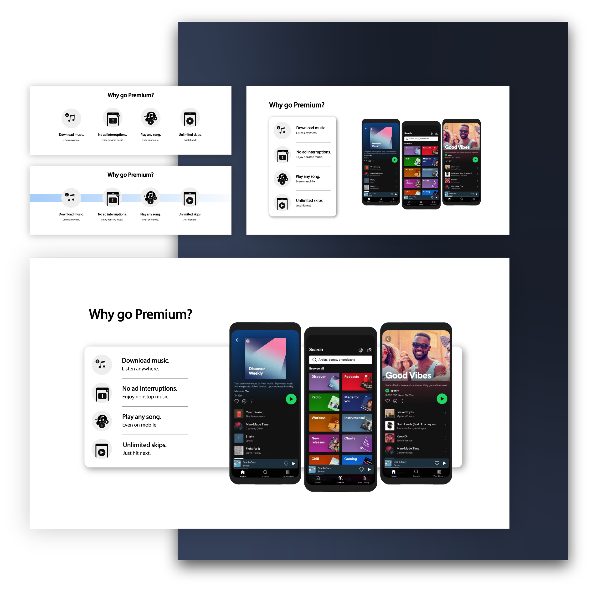
In this section, my design intent was to enhance the understanding of Spotify's features. One key issue I identified with the original website design was the lack of a visual reference to demonstrate how these features would appear on the platform's interface. Users are more likely to subscribe or make a purchase when they can see and evaluate the quality of a product or service.
To address this, I incorporated an image of Spotify's platform to provide a clear visual representation of its interface. This allows users to connect the described features with their practical application. Additionally, I added a vignette effect to visually link the phone mockups to the feature descriptions, ensuring clarity and reinforcing the connection between the interface and its functionalities. This approach helps create a more compelling and user-friendly experience.
Pricing
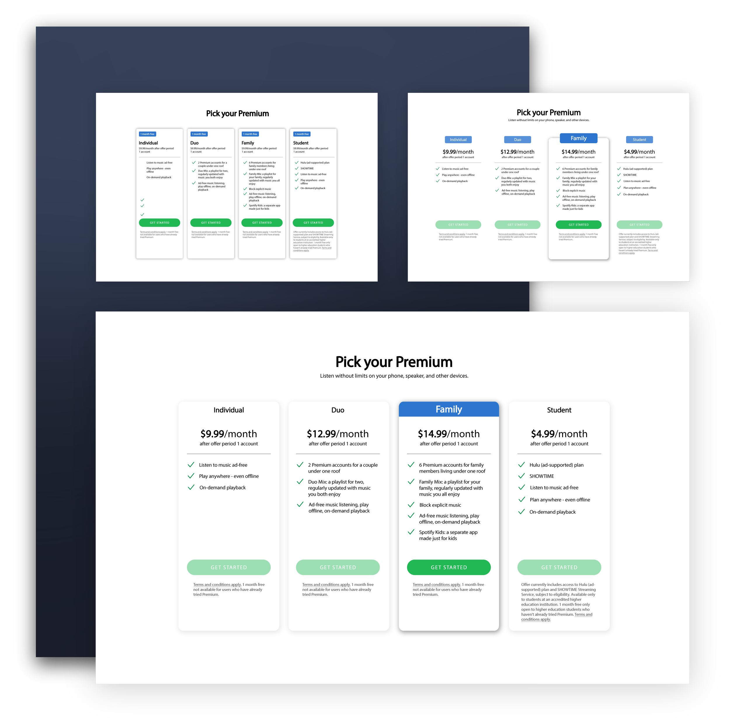
In this section, which is primarily informational, I implemented hierarchical design principles to make the page more engaging and visually appealing. The original design featured a uniform layout for all plans, which made the page feel static and less interactive. To improve this, I introduced dynamic elements, such as highlighting specific containers when users hover or click, to enhance interactivity and create a more engaging user experience.
Additionally, I emphasized the most critical aspects of the page, such as pricing, plan details, and call-to-action buttons—by increasing font sizes and strategically highlighting key elements. This ensures users can quickly identify essential information, like which plan suits their needs, how much it costs, and where to click to proceed. These visual enhancements help guide users seamlessly through the decision-making process.


